Nokia’s love for pure(ity) seems to never go away, since the days of the Nokia PureView to the current Nokia Pure UI.
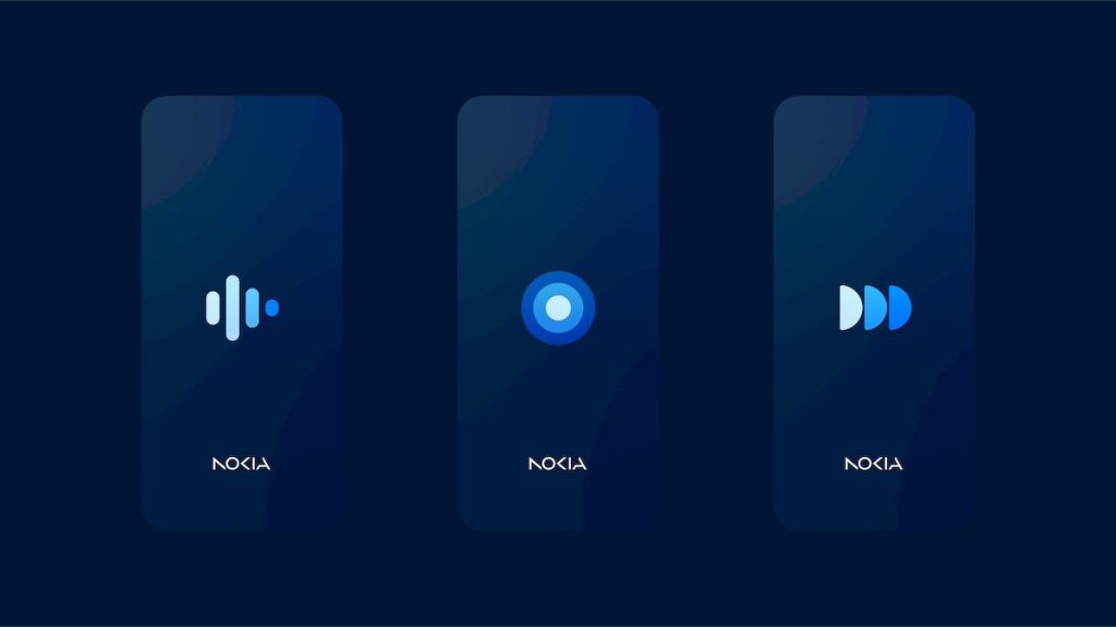
Nokia had announced its new logo as part of MWC 2023 with the spirit of keeping the future more digital. Today with Nokia Pure UI, they have taken one more step towards the digital future, which seems to be more trending to being more minimalistic.
The new Nokia Pure UI introduces new visual concepts to the Finnish brand’s digital products.
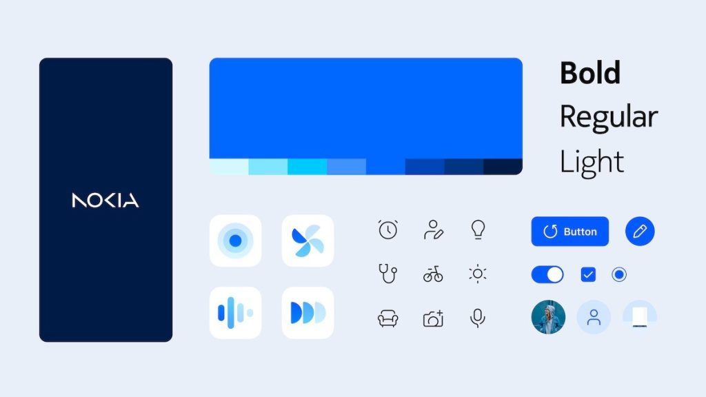
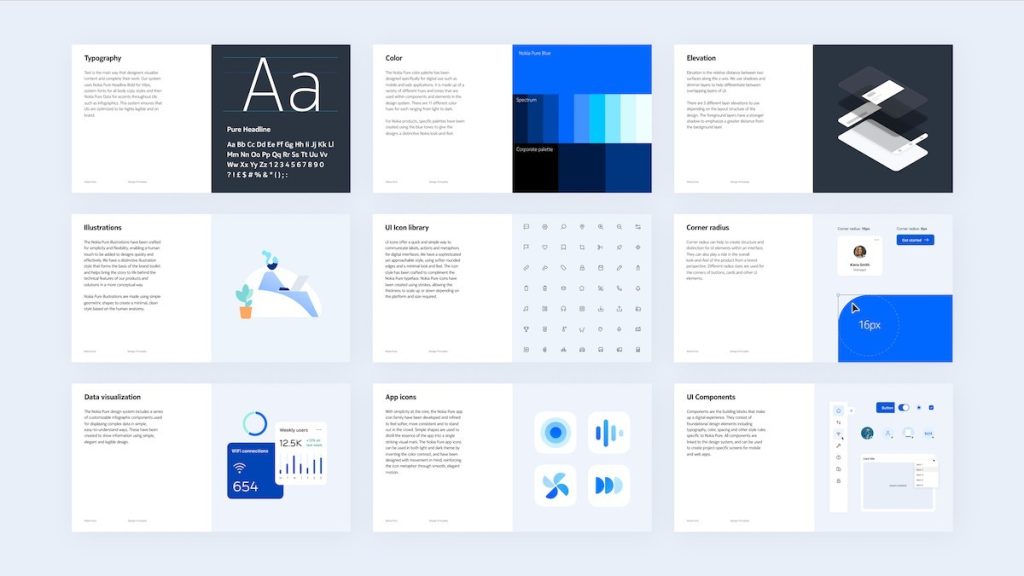
According to Nokia, the new design system was developed towards creating digital products which will be future-proof, using various elements and guidelines which are focused on giving users a minimal and “fresh” new style, in-line with the logo reveal from a month ago.


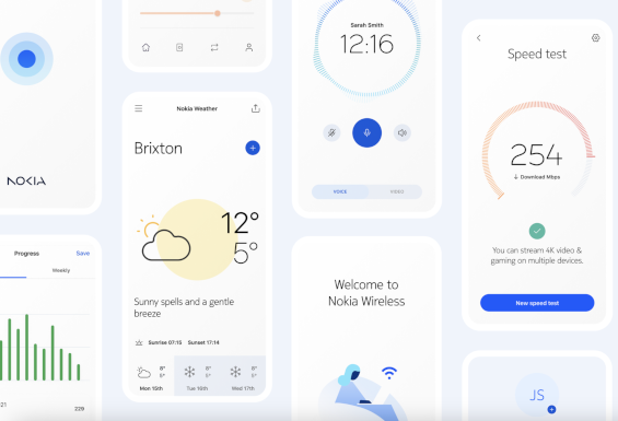
Nokia laid out several details in designing the new UI. The icons as well as typefaces have been thoughtfully redesigned, with a focus on flexible strokes that can adapt to different hardware platform sizes. This design language extends to the onboard illustrations, as well as infographics and screens which display visualized data feeds and infographics. The Nokia team has also prepared standard elements that designers can use to quickly build consistent-looking screens.
Nokia Pure UI has powerful components that can be used to build complex web-based dashboards, for example. The interface is designed to scale from tiny wrist-worn displays to large wall-mounted panels. Looking forward to see the UI integrated across Nokia products, including its own website and maybe wearables in the future.


Leave a Reply